

Share This Article
There is a particular kind of confidence required to build an entire interior around a single colour. Not to use one colour as a backdrop against which other things happen, but to commit to it so completely that the walls, the ceiling, the floor, the furniture and the fixtures all speak the same visual language from the moment you enter to the moment you leave.
This is not minimalism in the conventional sense. Minimalism is about reduction, about taking things away until only the essential remains. Monochromatic design is something different. It is about depth. About the understanding that within a single colour there is an entire world of tone, texture, material and light that most designers never explore because they reach for a second colour before they have exhausted the first.
The spaces doing this most thoughtfully right now are among the most memorable retail and wellness interiors being produced anywhere. They prove, consistently and convincingly, that restraint is not a limitation. In the right hands, it is the most powerful design tool available.
When the palette is the brief
Before looking at the projects themselves, it is worth understanding why this approach works as powerfully as it does. The human eye and brain process environments with a great deal of information arriving simultaneously: colour, form, texture, light, scale, material and movement all compete for attention at once. In a conventional retail environment, that competition is managed by hierarchy, by directing the eye to what matters most through contrast and variation.
A monochromatic interior changes the terms of that conversation entirely. When colour variation is removed or reduced to a single register, the eye is freed to notice other things. Texture becomes extraordinarily prominent. The difference between a matte surface and a polished one in the same colour reads as a dramatic material shift. Light becomes a design material in its own right, modelling the surfaces it falls across in ways that would be invisible in a more varied palette. Scale and proportion come forward. Details that would disappear against a complex background become the focal point of the entire room.
This is why the most successful monochromatic spaces always feel richer than they look in a photograph. The photograph can capture the colour but it cannot fully convey the depth that reveals itself only in person, only when you are inside the space and your eye begins to trace the variations it had not expected to find.
The Skincare Tools Store – Clinical precision as spatial experience
Wrongdoorstudio.com
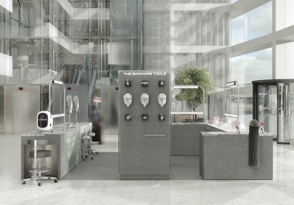
The project that anchors this conversation most directly is the retail interior designed for The Skincare Tools, a premium Australian beauty technology brand. The brief was to translate the logic of professional skincare into a physical environment, and the design team responded by building an interior entirely from royal white granite stone, stainless steel, medical glass, frosted acrylic, fine metal mesh and soft integrated lighting.
Every material in the palette belongs to the same cool, clinical family. The result is a space that looks less like a conventional retail environment and more like a laboratory in which extraordinary objects happen to be available for purchase. The layout follows four treatment stages, Cleanse and Prep, Activation, Sculpt and Lift, and LED Therapy, each clearly delineated not by colour change but by spatial organisation and object placement within the same unbroken visual field.
The only colour accent in the entire space is the red glow of the LED therapy devices, and it is precisely because everything else is so rigorously controlled that this single warm note carries such weight. It does not disrupt the palette. It confirms it. The restraint of the surrounding environment makes the accent meaningful in a way it could never be in a more varied space.
Lead Architects: Kseniya Popova, Olga Kulichihina
Source: wrongdoorstudio.com
Lenspoke, Dubai – Warmth as precisionDesign Nomad Studio, Jumeirah, Dubai
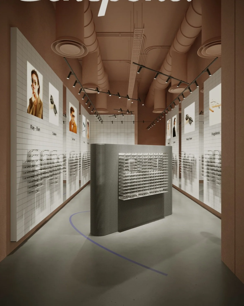
Situated within Triple777 Mall in Jumeirah, Lenspoke is a 63 square metre premium eyewear boutique designed by Dubai-based Design Nomad Studio under the creative direction of Zahir Abdul Latheef. Where The Skincare Tools Store works in the cool register of silver and white, Lenspoke operates at the opposite end of the warmth spectrum, enveloping the entire space in rosewood and terracotta hues that create what the studio describes as a cocoon-like ambiance that is both comforting and chic.
The monochromatic commitment here is equally complete. The warm palette extends across walls, fixtures, display surfaces and ceiling, with exposed ductwork painted to match rather than contrast. The single material counterpoint is the perforated metal mesh of the central display structure, a sculptural centrepiece that presents eyewear as precious artefacts within a museum-like setting, functioning simultaneously as storage, art installation and spatial anchor.
Lenspoke demonstrates something important about monochromatic design: it is not a cold or clinical proposition by nature. The colour chosen determines the emotional register entirely. The same commitment to a single palette that produces clinical precision in a grey interior produces intimate warmth in a terracotta one. The discipline is the same. The experience is completely different.
Zahir Abdul Latheef – Founder and Design Director
Source: designnomad.studio
Geetanjali Salon, New Delhi – The monolith as architecture Metanoia Designs, Greater Kailash, New Delhi

Of the five projects in this article, the Geetanjali Salon in Greater Kailash, New Delhi designed by Metanoia Designs is the one that commits most fully and most architecturally to the monochromatic idea. Spanning 4,925 square feet across three floors of a transformed commercial building, the interior is described by the studio itself as a monolithic approach where colour extends across walls, ceilings and all architectural surfaces to read as one continuous carved volume.
The palette is terracotta, red travertine and microtopping, materials drawn from traditional Indian craft and landscape and applied with an ambition that goes well beyond surface treatment. This is not a space decorated in terracotta. This is a space made of it, where the colour is the architecture rather than a finish applied to it. Stainless steel appears as a precise secondary material, at portals, reception elements, styling stations and architectural frames, acting as a contemporary intervention within the earthen envelope rather than a competing element.
The studio also deploys light as a tool of considerable sophistication. Large luminous ceiling panels conceived as contemporary skylights compensate for the limited natural light within the deep floor plate while reinforcing the spatial continuity of the terracotta shell above them. Photography by Avesh Gaur has given this project the visual record it deserves, though as with all monochromatic spaces, the images only begin to describe what the space actually feels like from the inside.
Prakhar Jain – Co-Founder and Principal Architect
Shivangi Sharma – Co-Founder and Partner
Source: meta-noia.in
Toteme Beijing – The flagship as sculptureHerzog & de Meuron, Sanlitun, Beijing
When Pritzker Prize-winning Swiss architecture firm Herzog & de Meuron designed the first China flagship for Swedish fashion brand Toteme in Beijing’s Sanlitun district, the result became one of the most talked about retail interiors of 2025. The monochromatic commitment here operates across two distinct registers held in deliberate tension: the exterior is pleated white stone transitioning into white metal, while the interior works in an equally complete but entirely contrasting palette of high-gloss black lacquer wood across floors and ceilings.
The white staircase, fabricated in lacquered steel, connects both floors as a sculptural centrepiece whose geometry zigzags through the space with a precision that would be illegible against a varied background. Against the black lacquered floor and ceiling it reads as a complete architectural statement. Ready-to-wear is set against pleated white fabric walls. Accessories rest on rippled glass conceived as a reference to ice, a nod to Toteme’s Scandinavian heritage. Jewellery sits under hand-blown glass domes at the upper level.
As studio partner Ascan Mergenthaler noted, the restrained colour and material palettes reflect Toteme’s core values while also functioning as a subtle nod to Chinese culture and craftsmanship. The restraint is the luxury. The monochrome is the message.
Ascan Mergenthaler – Senior Partner, Partner in Charge of the Toteme Beijing project
Pierre de Meuron – Founding Partner
Jacques Herzog – Founding Partner
Source: herzogdemeuron.com
Aesop Diagonal – Stone as total environmentMesura, Barcelona
The Aesop store on Avinguda Diagonal in Barcelona, known as Aesop Diagonal, designed by Spanish studio Mesura and winner of the Dezeen Awards 2024 Interior of the Year, represents perhaps the most radical application of monochromatic thinking in contemporary retail. Rather than working with colour in the conventional sense, Mesura built the entire interior from salvaged stone remnants of 19th century Gothic buildings, fountains and archways sourced from demolition sites across Barcelona.
The result is an interior in which every surface, every counter, every display element and every structural feature speaks the same material language. Not because a single paint colour has been applied across everything but because a single material family has been used throughout, with all its variation in texture, patina, age and geological character intact. The stone does not match. It coheres. And that distinction is precisely what makes the space feel less like a design decision and more like something discovered rather than constructed.
Aesop’s commitment to site-specific retail design is well established, but the Barcelona store represents the fullest expression of a philosophy the brand has been developing across decades: that the most powerful retail environment is one that connects so completely to its context and its materials that the products it sells feel like a natural extension of the space rather than the reason it exists.
Jaime Font Furest – Co-Founder and Partner
Carlos Dimas Carmona – Co-Founder and Partner
Marcos Parera Blanch – Co-Founder and Partner
Benjamín Iborra Wicksteed – Co-Founder and Partner
Jordi Espinet Romà – Co-Founder and Partner
Source: mesura.eu
What these five projects share
The palette of each project could not be more different. Cool silver and white. Warm rosewood. Deep terracotta. Black and white in extreme contrast. Ancient stone. Five completely different colour decisions that nonetheless produce the same fundamental spatial quality: an interior that feels complete, coherent and entirely itself.
That completeness is not accidental. It is the result of a commitment made early in the design process and held consistently through every subsequent decision. When a colour is chosen as a total environment rather than a backdrop, every material, every fixture, every light source and every object must either reinforce the palette or be excluded from it. There is no middle ground. There is no room for something that almost works.
This level of discipline is harder than it looks. It is also, when executed with genuine intelligence, the difference between a space that is beautiful and a space that is unforgettable.
